Showing posts with label bd. Show all posts

Thursday, 3 March 2016

Oom Tim - work in progress

 Nederlandse versie (English version: see below)

Voor P@per-stripmagazine maak ik elke keer een stripje over Oom Tim, die allerhande onnozeliteiten beleefd samen met zijn neefjes Kurt en Ivan, en het hondje Tanguy, dat hij onder zijn hoede nam nadat de psychiatrisch zieke  buurman er niet meer kon voor zorgen...
Daarnaast verzorg ik ook de (fictieve) roddelrubriek, maar da's een ander verhaal :-).

Hieronder de verschillende fases bij het maken van een Oom Tim-pagina.  Vroeger tekende ik Oom Tim nog op papier, waarna ik alles inscande en daarna digitaal inkleurde. Sinds kort werk ik echter volledig digitaal (op een Yiynova), wat beter en beter begint te lukken. (voor andere projecten werk ik wel nog graag analoog, met bv. aquarel of zo).
Vooral de stap van het inscannen kan ik nu overslaan, wat niet zoveel tijdswinst oplevert, maar er wel voor zorgt dat mijn tekeningen in inkt scherper blijven.  Bij het inscannen heb je namelijk soms het probleem dat je de Niveaus/Levels van je tekening moet aanpassen, en daarbij de lijnvoering aantast... Als je volledig digitaal werkt, heb je dat uiteraard niet.

Scroll naar beneden voor de beeldjes met commentaar.

English version

For P@per, a Flemish comics magazine, I make a comic about "Uncle Tim" and his adventures with his nephews Kurt and Ivan, and the little dog Tanguy. Tim took care of Tanguy after his mental ill neighbour couldn't do that anymore.  
I also write the fictional gossip column for P@per, but that's another story.

Below you can find the different phases I work through in making an Uncle Tim-page.  I used to work traditionally, with pencil, paper and ink, but since that I bought a Yiynova screen, I work fully digital for Uncle Tim (for other projects, I like to keep working with water color).
I don't have to scan my original pages anymore, but that's not the main advantage of working digitally.  The great advantage is that by drawing digitally, with the pencil, you get a neat crisp ink line that prints really clean. When you work analogue/traditionally, you  scan the original and then you have to change the "Levels" and/or "Treshold" of your drawing to get a good contrast, which changes the original ink lines too much (it makes them thicker or smaller). See the comments with the pictures for more about that.


Eerste schets in lichtblauw (da's een oude traditie die wortelt in bepaalde praktische overwegingen mbt reproductietechnieken).
First scetch in cyan (an old tradition actually).

Uitzetten van de definitieve lijn, in rood.
Putting the "right" line, this time in red.

Ininkten
Ink-version
Detail van de inktversie. Gemaakt met het potloodje, waardoor je een harde rand krijgt, in tegenstelling tot de penseel. Het voordeel hiervan is dat je een extreem scherpe lijn krijgt bij het afdrukken.  Je moet wel op een voldoende hoge resolutie werken nl. 600 ppi.

Detail of the inkversion.  Make with the pencil, not with the brush.  It gives you a hard clean edge when printing.  You need a high resolution like 600 ppi to make that work.

Inktversie met algemene sfeerkleur.
Inkversion with general atmosphere colour.

Eerste kleurversie.  Omdat de inkt met het potlood is gezet, ken ik zeer snel met de toverstaf en het emmertje gebieden selecteren en vullen. 
First color version.  The inks were made with the pencil, giving them a hard edge, thus making selection with the magic wand very easy. 

Schaduwen toevoegen, om meer diepte te creëren.
Adding shadows, to create more depth.

Een verloop op de achtergrond, i.p.v. een solide blauwe achtergrond.
The massive backgroundcolor is now changed to a nice gradient.

Kleine effectjes (de schud-lijntjes rond Tanguy).
Adding little effects, like the lines around Tanguy.

Tekst toevoegen.
Adding text.


Wednesday, 3 June 2015

Comic artists that I admire #2: Thierry Ségur

Thierry Ségur is another (French) artist that I admire very much.  Without his work, I wouldn't have made the transition from children comics to adult comics (or BD - Bandes Dessinées as they call them in France).  By shifting to comics for a more mature audience, I understood that comics are more than just big-nosed funny characters.
So without Ségur's work, I would have probably lost my interest in drawing.  At a certain age, playing guitar, being cool and impressing girls (well at least in my case ;-) ) becomes more interesting  than drawing comics, which seems a nerdish hobby at that age.  

But that dark scenario did not happen :-).  So, why did I like Ségur's work?

Reading comics in the nineties
It all begin at a new years eve somewhere in the beginning of the nineties, when we were visiting my aunt and uncle and I was browsing through the new comics that my older cousin bought.

Among those comics was a particular case, titled "De legende van de dorre gewesten" (the legend of the droughty countries).  Below you see the original French cover, which actually refers to "forgotten countries".


Why was this album so different for me
I was 14 years old at that time, and this album was quite different from what I had seen or read before:
  • It was hard cover, and larger than A4.  Flemisch comics at that time were on a smaller and softcover format.  So Ségur's work looked more precious (or expensive).
  • Flemish comics had a flat colouring at that time.  Ségur's work was probably watercolor with other media.  Actually this was the first time I saw painted comics.
  • Ségur doesn't draw in a caricatural of realistic style, but somewhere between. At that time I only knew funny comics like Spirou (Robbedoes), les Tuniques Bleues (Blauwbloezen) or  more realistic stuff like "De Rode Ridder" (the red knight).
  • The story was pure fantasy.  At that time, fantasy wasn't that mainstream as nowaday.
  • The charactersmade a psychological evolution through  the story, which was something new for me.
  • The visual language was new to me, with the use of movie techniques like zooming, panning, ... 
Someone who read French adult comics in the seventies must have  been already familiar with all this stuff, but in the Dutch-speaking market this was all fairly new.

If this album would have been published right now, it wouldn't be so unique anymore, except maybe for the authentic painted style that Ségur uses.

A first look at the book
Just by opening the book, the reader dove into the world that Ségur created.  The first spread that is glued to the hardcover, was a gigantic close-up from one of the most impressive images from the book:   Hürl the thunderknight making his entry among a raging storm of flashlights...
Maybe not that impressive here on screen, but on a 50x35cm format: wow!


Ségur's drawing style
As already told, Ségurs work was the first painted comic that I saw.  I suppose it's mainly watercolor (aquarelle).  In the first album, the colours are all quite bright and vivid, just like the atmosphere of the story itself.  When the story evolves, in the second and third album, the colors are scaled down and Ségur uses more desaturised (greyish) colours, which fit perfect with the darker atmosphere in the third part.


The opening page (click to zoom)

Also his linework evoled from thicker in the first album, to thinner in the third.


Page from the third album.

My personal "Aha-erlebnis" (wow-moment) was that Ségur's drawing showed me that a good drawing is actually a flat representation of a 3D-object.  You always end up with a line-drawing, but you should start by thinking about the three-dimensional form.   Now that's common knowledge for me, but at that time it was new for me.  I see this also  when I teach my illustration courses: when you learn your students about perspective and dimensionality,   they start making huge progressions.
I think that perspective and dimensionality are  really essential for anyone who wants to draw stuff  by heart, without reference.

Another visual representation of fantasy
Ségur's work was one of the earlier fantasy-comics.  You can still see it when you look at how the fantasy-world was conceived: plants, rocks, etcetera are conceived quite differently from what you see in regular fantasy nowadays.

Click to zoom.

Click to zoom.


There are two reasons why Ségur's way of visual representation is different:

Firstly, the global influence of internet makes that nowadaysthere is a certain canon of how fantasy should look like.  Orks, elves, etc. have a general look, as if there is a standard, or a canon about it.    Especially since Lord of the Rings, fantasy has been streamlined into a certain visual style.  Ségur made his work before the internet really boosted (end of the eighties), and had to make up his world by himself, without much help or influence from others.

Secondly, Ségur is French.  Frenchmen are a bit more chauvinist when it comes to accept influences from other countries/cultures. 
In the seventies and maybe still the eighties France was even quite protectionistic towards its own cultural production. I believe that in that time (and maybe still now for certain radio or television networks) there was a quotum on the minimum amount of French songs that should be played...
This typical French mentality made that French fantasy and science-fiction evoled a bit more independent than in countries where the American influence was bigger.
French science fiction style was actually so apart from the American style, that in the seventiefrench SF series Valerian (by Mezières) actually influenced Star Wars (the design of Han Solo's spaceship, and even Darth Vader). Other authors like Moebius made designs for movies like Twelve Monkeys (that's in the mid-nineties). For Luc Bessons's "Fifth Element" (with Bruce Willis) both Mezières and Moebius developed the layout of the movie (e.g. the flying cabs).
So the American influence on French artists was at that time quite marginal, which resulted for the French comics in more original storylines and graphic design. 
Of course, nowadays French SF and fantasy is much less original than it was back in the seventies and eighties.

Of course now it seems that only Ségur worked on these albums, but the script was written by  Chevalier.  He and Ségur knew eachother through the world of Role Playing Games.  Actually there has been made an RPG from  "La légende..." later on. I do not know what influence Chevalier had on the visual style of the albums...

The story itself.

The story itself was written by Chevalier, and was one of the very first French fantasy albums (even before "The cristal sword"). "Editions Delcourt" published the albums as one of the very first fantasy series. Nowadays publishers like Delcourt and especially Soleil are publishing too much fantasy and SF; in general there is even an overproduction of comics in France (every day 6 new comics are published).
But in those days, "La légende..." was unique and trendsetting. If "La légende" was published in 2015 instead of of the late eighties, I do not know if the albums would still stand out in a shop among all the other new albums...

Cover for the second album.


In the story itself, 3 dwarfs have to fullfill a quest: finding their king.  That starting point is used a lot in fantasy.  For this purpose, they make a fellowship (sounds also very familiar) but not in the same way as it happens in "The fellowship of the Ring" (LOTR).  The three dwarfs engage Firfin, a thief from the Lïn-people, and the barbaric warrior Morkaï.


By the end of the first album, the fellowship breaks up after an attack of some kind of orks (just like in LOTR), but then the story takes another lead in the next two albums, when it turns out that the quest is manipulated by an old evil forcen and it seems that nobody can trust his friends or even family anymore...


The story consists of three albums.  The second sold at the time 45,000 copies, a huge succes for a French fantasy series in those days.

It took some years before the third part was published, because Ségur did some storywork for the movie "Trooper" by Christophe Gans.


The three albums


Ségur after this story

Thierry Ségur didn't make much comics after "La légende".  He did more illustrationwork and  some storyboarding for movies, like "Le pacte des Loups".
"Le roi des méduses" (the King of the jellyfish) was published a few years after "La légende", and was drawn in his particular style, but the story was quite complicated (it took me a while before I read the whole story). "Le roi des méduses", scripted by Igor Szalewa. Other work he did are Krok le Bô (1990), also scripted by Chevalier.  It didn't find a translation of that in Dutch so I haven't read it yet (nor have I found the original version in French).


Some years ago, there were plans for a sequel to "La légende...", but eventually the project was aborted.  


Getting the albums
You can still get the albums in French language; if you're looking for a Dutch version you should check out the second-hand comic shops, where they can still be found.  Not because they didn't sell well, but because the Flemish publisher printed too much copies at the time.


All images: copyright Ségur/Chevalier.

Click  here to see the other comic artist that I admire. 


Tuesday, 26 May 2015

Comic artists that I admire #1: Rosinski

The first of the artists that I present here (not in a particular order) is Rosinski. Click here for the overview of the other artists.


Rosinski in the eighties

Rosinski (°1941)  started als a professional illustrator in Poland at the time of the cold war, begin seventies.
He made some Polish comics, illustrations for school- and children's books but his big succes started in 1977 when he was asked to draw the Viking/SF-saga Thorgal, written by Jean Van Hamme. That comic was published in the Belgian comics magazine "Tintin", which had at that time a French and a Dutch version.

This series was a huge succes, not only by the artwork of Rosinski but also because of the stories itself, which attracted a huge female audience as well... The story themas vary from Norse mythology to pure fantasy and a mix of romance, drama, horror,...

I saw Rosinski's work for the first time in "Kuifje", which is the Dutch-language version of the Tintin-magazine.  The 5th album "De schaduwen voorbij" (Au-delà des ombres) appeared somewhere begin 1980's, and as a 8 or 9 years old boy, who was only familiar with classic Belgian comics like Tintin, Suske en Wiske, the Smurfs, etc, this story opened a whole new (graphical) world to me...


The opening page of "Au-delà des ombres" (Thorgal #5)

Rosinski sent his work from the other side of the iron wall to Brussels, where Tintin-magazine was published.
Difficulties in 1980 in Poland (the Solidarnosc-era) made it difficult to sent his original work  to the Tintin-editor, so he migrated to Belgium (his family followed later on). He got the Belgian nationality at that time and in our country, he made some of his finest work (who wouldn't ;-) ) but later on he was lured to Switserland by some of his admirers there... Nevertheless he kept his double nationality (Polish-Belgian) and didn't become a Swiss citizen.

So Thorgal  is his most famous series.
In this series he evolved from classic black and white inking to a more cross-hatched style.

Classic style


Evolving from classic to more cross-hatching

Cross-hatching (original from the Qâ-story arc)
The covers for the albums on the other hand, were always painted.  Here a selection of the finest (in my opinion :-) ), but they do not necessary represent the finest stories.


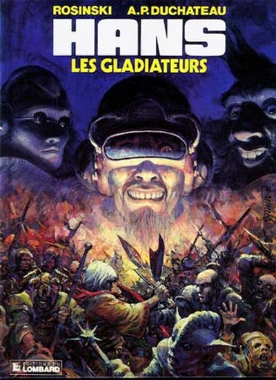
New Thorgal albums followed every year, but in the eighties he worked also on a pure SF-series with A.P. Duchâteau: Hans. From the fifth album on, another Polish illustrator Kas helped him and eventually took over the series from part 6 on...

Opening scene from the first album

Cover for "The Gladiators"

Thorgal is Rosinski's most-known series, but the "Chninkel"-one-shot (also in collaboration with Van Hamme, published in the end of the eighties) is considered as his masterpiece. It appears high in most rankings, with it's unique "Messiah-story-in-a-fantasy setting".


Cover

Nice black-and-white artwork

This albums originally appeared in black and white (166 pages) and consists of different chapters, which were pre-published in the "A suivre"-comics magazine.
There is also a more recent color version, but if you get the chance, buy the black-and-white version, because that's how it was meant to be. (The publisher's marketing department will say you definitely should buy both ;-) ).


In the nineties Rosinski made another 4-part fantasy-story "Laments of the Lost Moors / Complaintes des Landes Perdues (Fr.) /  Klaagzang van de verloren gewesten (Dutch)", this time with writer Jean Dufaux (another Belgian big-shot comic writer).

Put the covers two by two aside and you get a bigger image.


Laments of the lost moors/Complainte des Landes Perdues / Klaagzang van de Verloren Gewesten
Rosinski drew these 4 parts of the story, but some ten years after the last part, a prequel of "Laments of the Lost Moors" was launched, drawn by Philippe Delaby: "The knights of mercy".  4 albums were published. The "Knights"-cycle is finished, and now  Beatrice Tillier is working on a prequel for the Knights-prequel: "The sorceresses"...

Articles about these two talents are coming up on this blog :-).

After his wife died, Rosinski lost his motivation to make new work.   But he found a new drive leaving his inking technique for what it was, turning to direct colouring, with the interesting one-shots such as the Count of Skarbek (about the art-scène in the 19th century, script by Yves Sente) and Western (mostly coloured in sepia, script by Van Hamme).


Western (with Van Hamme)

Afterwards, he was motivated again to make new Thorgals, but this time also in direct color...

So Rosinski found a new drive, but writer Van Hamme was finished with Thorgal  and Yves Sente, who wrote the Skarbel-story, became the new writer.

Thorgal in direct colour (acryl, water color, ...)
In general, Rosinsky paints every picture on the scale he likes, and afterwards they're digitally combined into one picture.  This allows him to work at the scale he liks for each picture. For "Skarbek" for example, his originals were up to 1 meter (40 inch) in height...


Original art for Thorgal covers (which are published at +/- A4-format, the originals are about 40inch/100cm in height).


Rosinski monograph

Artbook

In 2013 a monography about Rosinski appeared.  Its scale (400 pages, 29.50 cm x 29.50 cm x 9.50 cm - approx.  11x11x3.5 inch) makes it difficult to fit in regular book shelves (or at least in mine), but it isn't that very expensive (+/- 50 euro, because it was printed and sold in high volumes) and provides a wonderfull overview of his work.  It also includes interviews with the writers he collaborated with and other stuff. But even if you don't speak French (or Dutch, if you can get a copy of that version), the book is still interesting enough :-). The book itself was layouted by his son Pjotr (certainly a talent for graphic design).

As Rosinski grows older (like anyone :-) ) and the time between new albums became longer and longer, three spin-offs were created: Kriss of Valnor (Thorgal's sexy but evil adversary) , Louve (about his younger daughter that can speak with animals), and "The youth of Thorgal", all drawn by other authors.

Confusing

A little remark aside: for anyone who also knows the Jugurtha-series by Franz: both Thorgal and Jugurtha were published in Kuifje at the same time, which confused me as a child. For some years (until I could read), I thought that Jugurtha and Thorgal were actually one and the same person...

Jugurtha by Franz

Thorgal by Rosinski

Reading list:

The best Thorgal story (in my humble opinion) is "Wolvin" #16, from the regular series, not the spin-off). You can read it without  being familiar with the rest of the stories, as it is a single story in the Thorgal saga.
If you don't understand English, French,Dutch, Polish or any other of the translated langues: try Alinoë (#6), a story with almoast no text.
Chinkel is a must-have for any comic-fan.  No discussion about that.

Read extracts online

On the publisher's website (Le Lombard) you can read extracts from any album by clicking the  "Lire un extrait"-button. This link brings you to Thorgal #1. Click "La série- les suivants" to move to the next Thorgal comics.

Links:

English publisher + shop
Belgian original publisher
Thorgal also exist in other languages... I didn't find a complete list, so you'll have to google for your own language...


Click  here to see the other comic artist that I admire.